Form ever follows function.
– Louis Henry Sullivan
This week, we started sending out previews of Project Highrise to press, YouTubers and streamers. Check out some of them on our YouTube channel. It was great to watch other people play the game. (By “great” here we mean a combination of anxiety about how people will react to the game and relief that they seem to actually like it.)
In the past, we’ve talked a lot about the game design and the systems in the game. In the process, we’ve also shown a huge variety of game art. So this week, we’d like to go back in time and look at the things that inspired the visual design of Project Highrise.
First, a bit of an abstract aside. We had an idea that we wanted the game to look like a past view of the future. Those imaginings are fascinating to behold – mainly to see how wildly wrong they were. Hence our offices with the hulking CRT monitors and some apartments with some very classic looking appliances and furniture. But there is an undeniable optimism to many of those images – especially those from the 1960s.
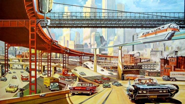
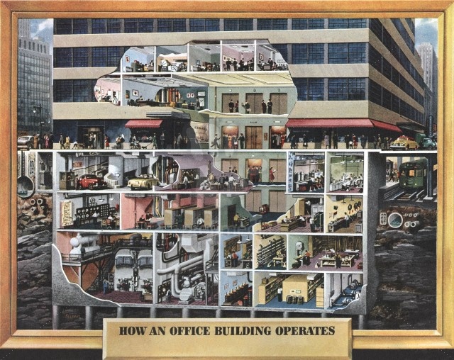
That ideal – that we can perfect the future through design – was pervasive in the early 60s. And we took many of our visual cues from that era.
Interiors
So let’s get specific with the 1960s. We’ll start at the bottom with the color and move our way up. So, looking at images and video from Project Highrise, these color palettes might look familiar:
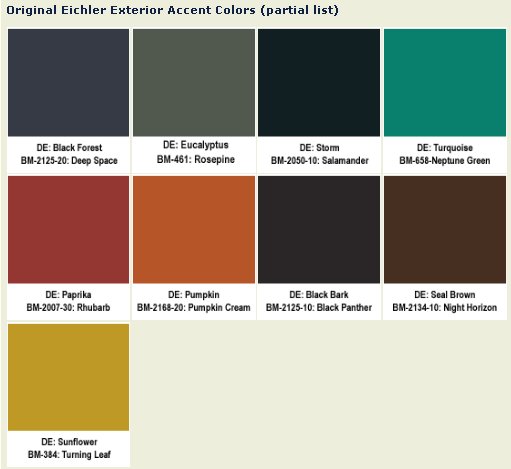
That’s a color palette from a 1960s home design catalog – specifically from Eichler homes in California. Look at some of the names: Pumpkin. Sunflower. Eucalyptus. The idea that the home or building should strive to part of its environment rather than obliterate and dominate was a new one in the 1960s. These colors reflect that outlook. We drew a lot of inspiration for wall colors and base colors from these palettes.
We’ve got a similar thing going on here. The colors are meant to evoke the materials that create an interior space – deep reds and browns from wood and leather along with blues and grays from glass and steel. Here’s an example of it all brought together:
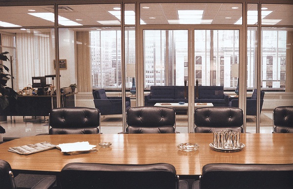
Except that’s not from the 1960s. It’s a Mad Men set piece. They did such a brilliant job bringing the 1960s back to life, we couldn’t resist. In fact, the early inspiration for the characters in Project Highrise came from the opening credits of said TV show:
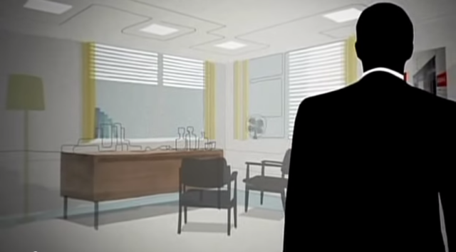
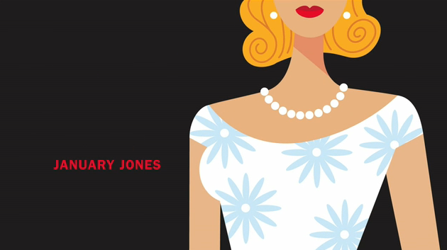
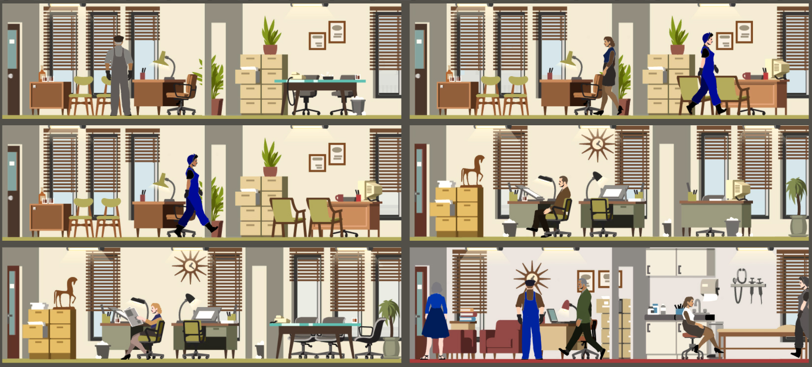
Ok, that last one isn’t from the series, but it’s inspired by it in the way that we were. In Project Highrise, players have to be able to identify people by type quickly. So we wanted stylized characters that still provided some opportunity for variation in clothing colors.
Here’s how that all came together in the game:
Exteriors
Those were some general influences from the 1960s (and from the 2010s view of the 1960s) when it comes to color and character art. Now let’s look at two monumental figures from the 1960s that we drew heavily upon for the visuals of Project Highrise – Ludwig Mies van der Rohe and Dieter Rams.
We’ll start with Mies. We live in Chicago as did Mies from 1937 until his death in 1969 and the city is chock full of his work. The outer skin of the building in Project Highrise is essentially a mash-up of Federal Center, the IBM Building and 860-880 Lake Shore Drive. Those are below in that order.
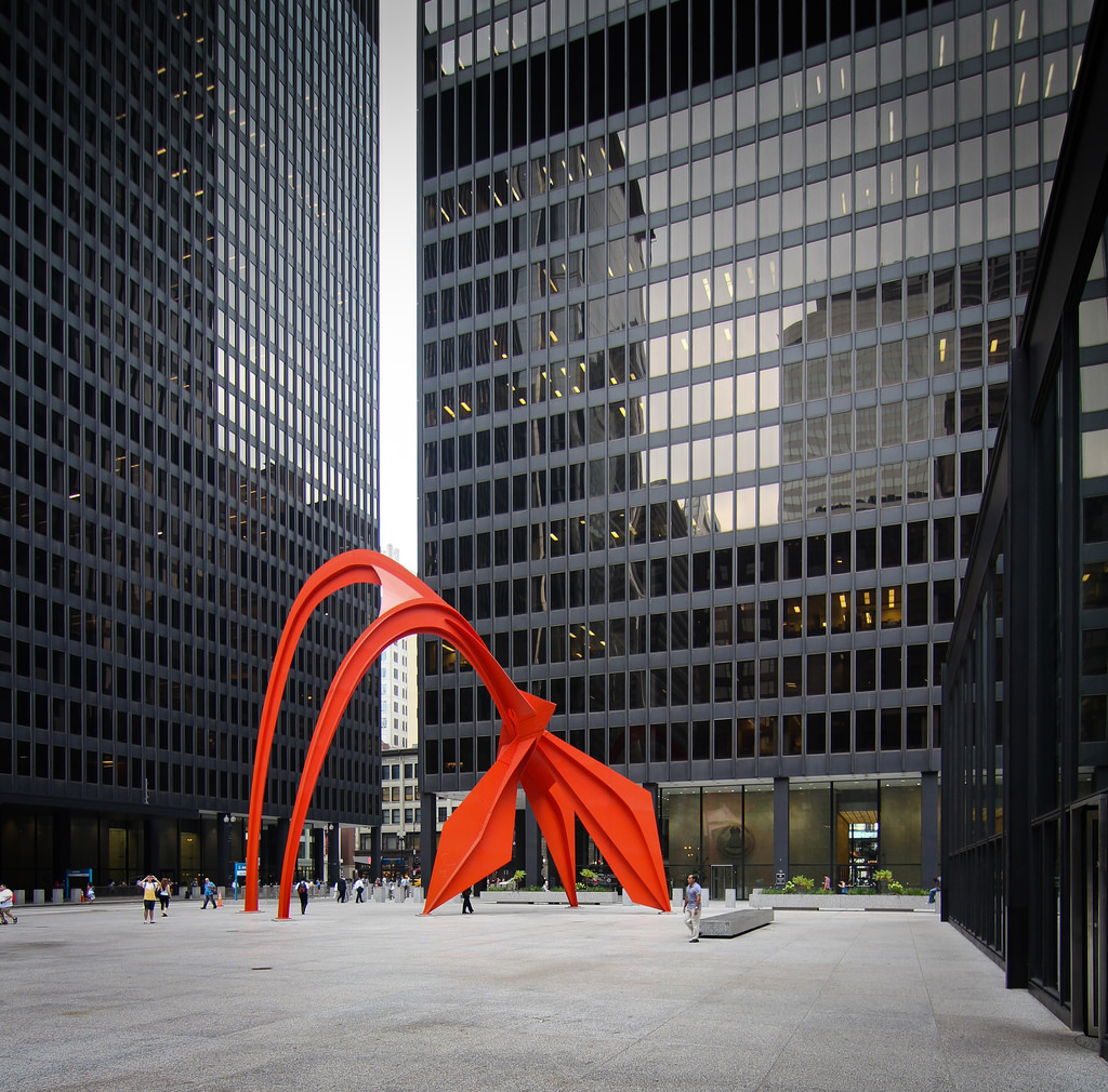
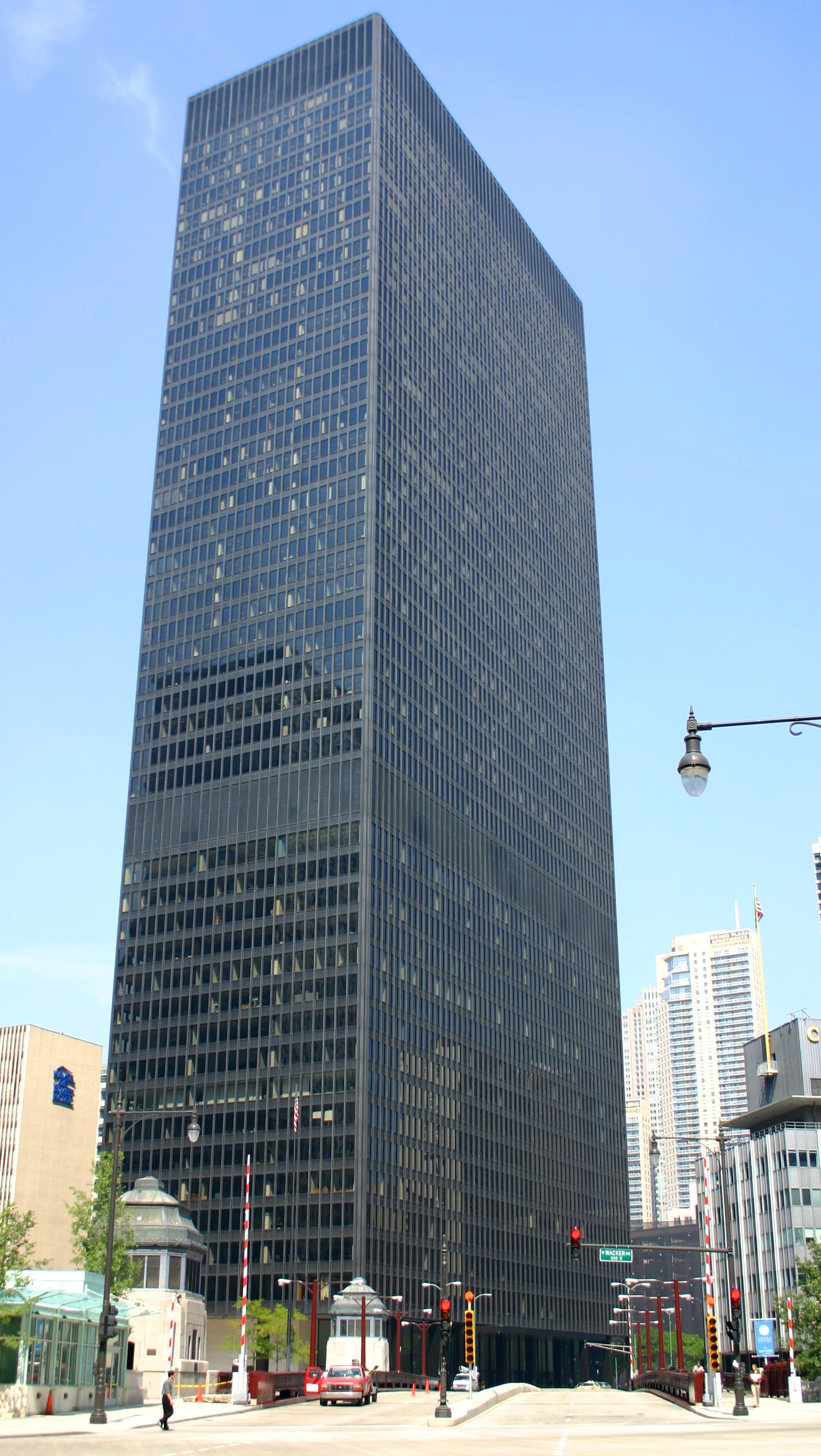
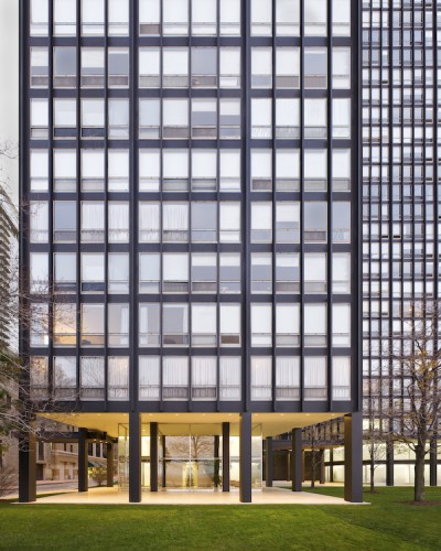
The Mies style of architecture was unprecedentedly bold: strong rectilinear grid, supporting beams and infrastructure on the outside instead of being hidden away, showing the materials from which the building was made right on the facade. It spoke of the technical optimism of the era, and the style became the dominant influence worldwide.
We wanted to evoke that in Project Highrise as seen in this exterior shot:

User Interface
A lot of the color that was used in the UI was specifically from the Federal Center. Speaking of UI moves us right into the other German we referenced – Dieter Rams and his Braun appliance designs from the 1960s. Let’s look at a few:
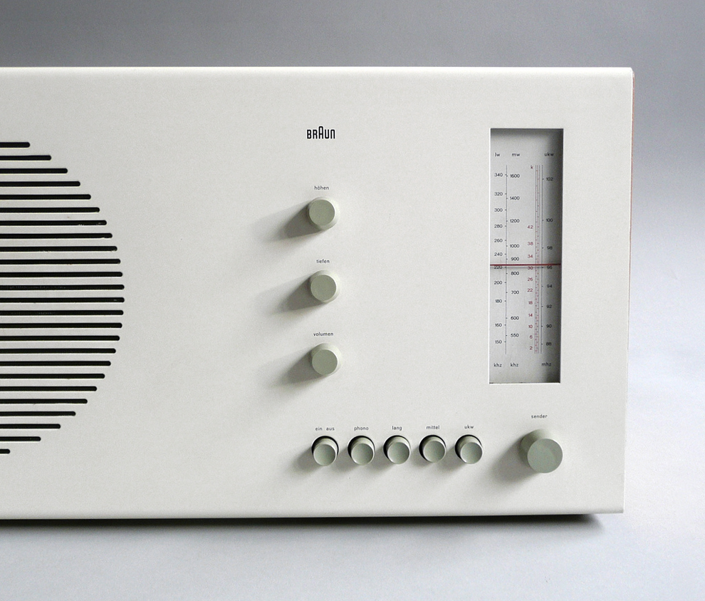
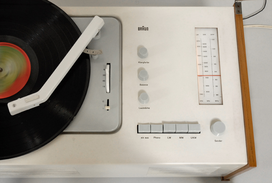
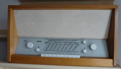
The clean layout and integrated typography is definitely reflected in our UI, with colors and icons adopted for screen display instead of physical products:
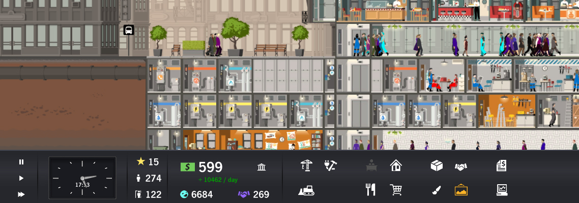
Here our inspiration was less visual and more layout. There is a clean, easily understandable layout that adheres strongly to a grid. Things are very simply yet elegantly balanced. All of the buttons are the same size. The knobs are in proportion to one another. And if you get closer, you can see some lovely typography. And it’s to a bit of typographic inspiration that we’ll move to next. Here we again looked back to the 60s – specifically to Swiss design. They made some really smashing posters like this one:
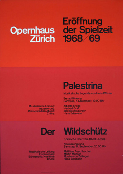
The grid. The colors. The type. Doesn’t get more 60s modern than that, does it? So it’s with that that we’ll end our review of the visual inspirations behind Project Highrise.
As a final aside, we’ve heard a few people say it looks like the 1990s. I think that’s our “alternate future” bulky CRT monitors and dot-matrix printers. And also your humble narrator (and art director) is a child of the 90s having gone to high school and college in that decade. Much of it was spent (re-)discovering the music and fashion of our parents. Who mostly grew up (you guessed it) in the 60s.
